MG FONT
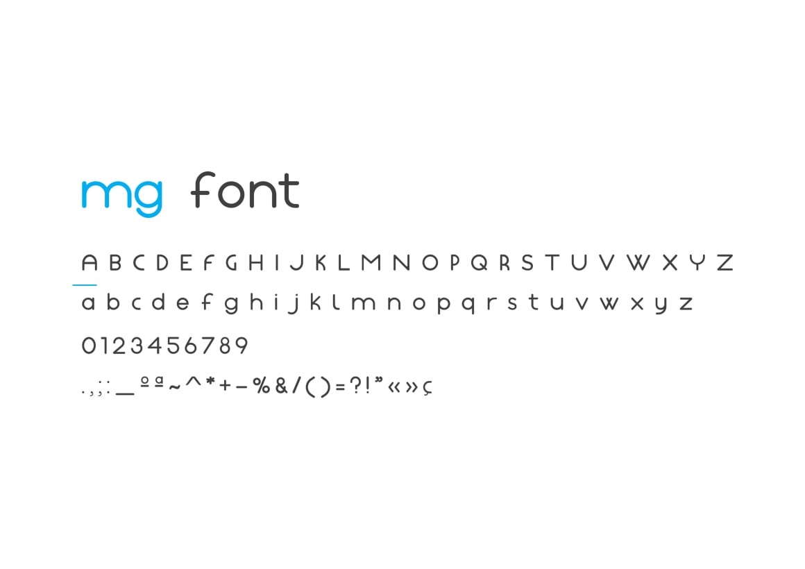
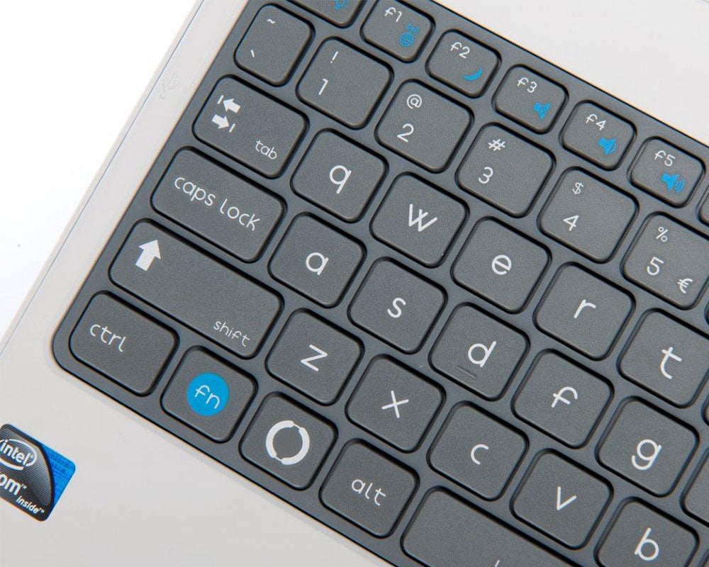
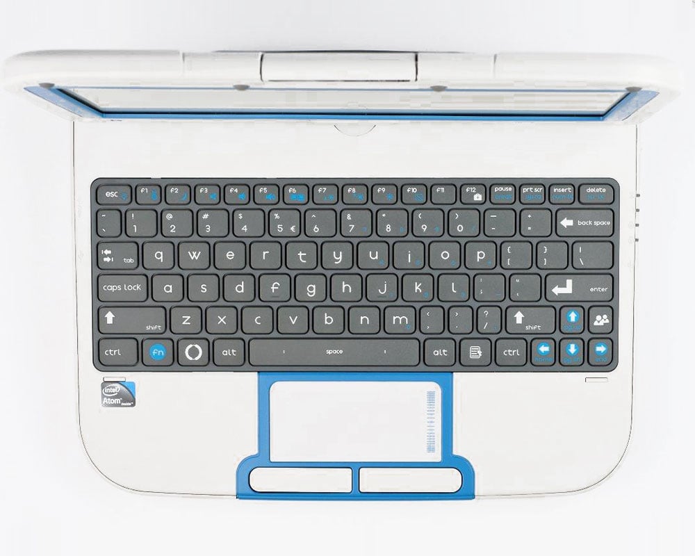
Development of a typeface for institutional use, mainly Magalhães products.
Through several concepts linked to the products’ image, we have developed a typeface with characteristics where the dynamic and innovative shapes, the simplicity in reading, and the perception of an amusing handwriting are present, thus reflecting some proximity to the educational universe.
Complete development for the company JP-IK


